Søren Vigand Kryger
A selection of work across brand identity, digital products and visual communication. Different kinds of projects, but usually the same goal: make things clearer, simpler and better to use.
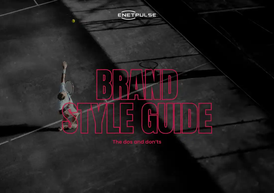
Brand
Style
Guide
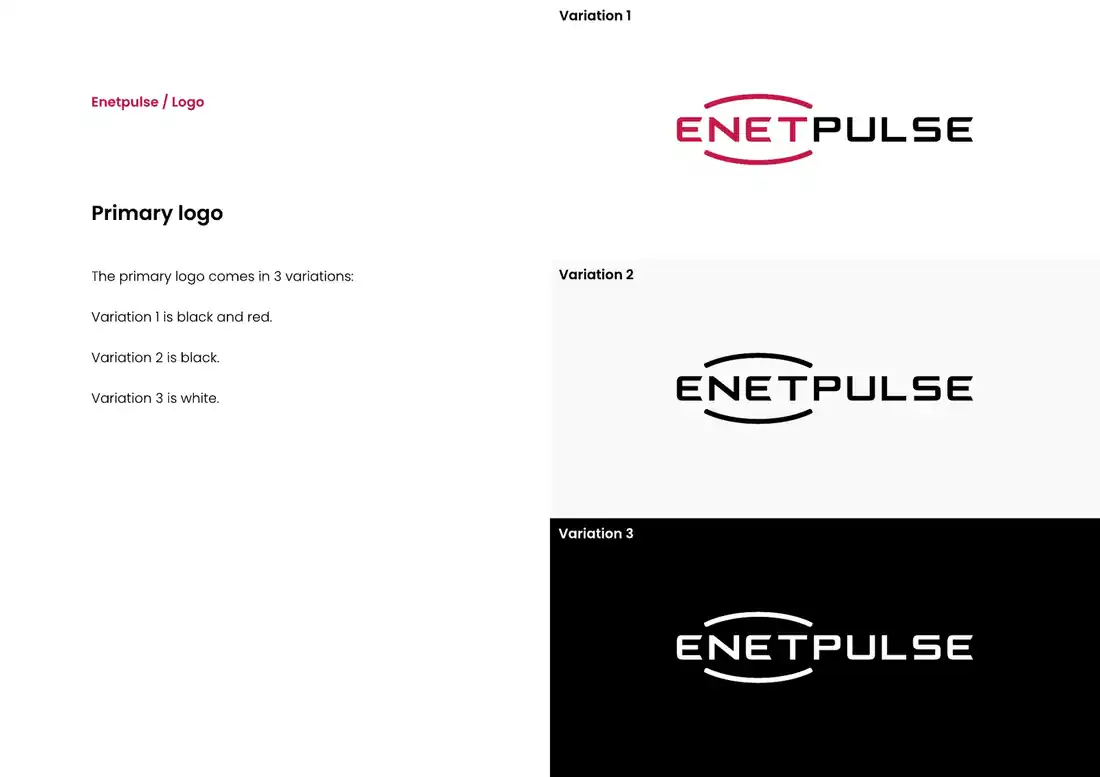
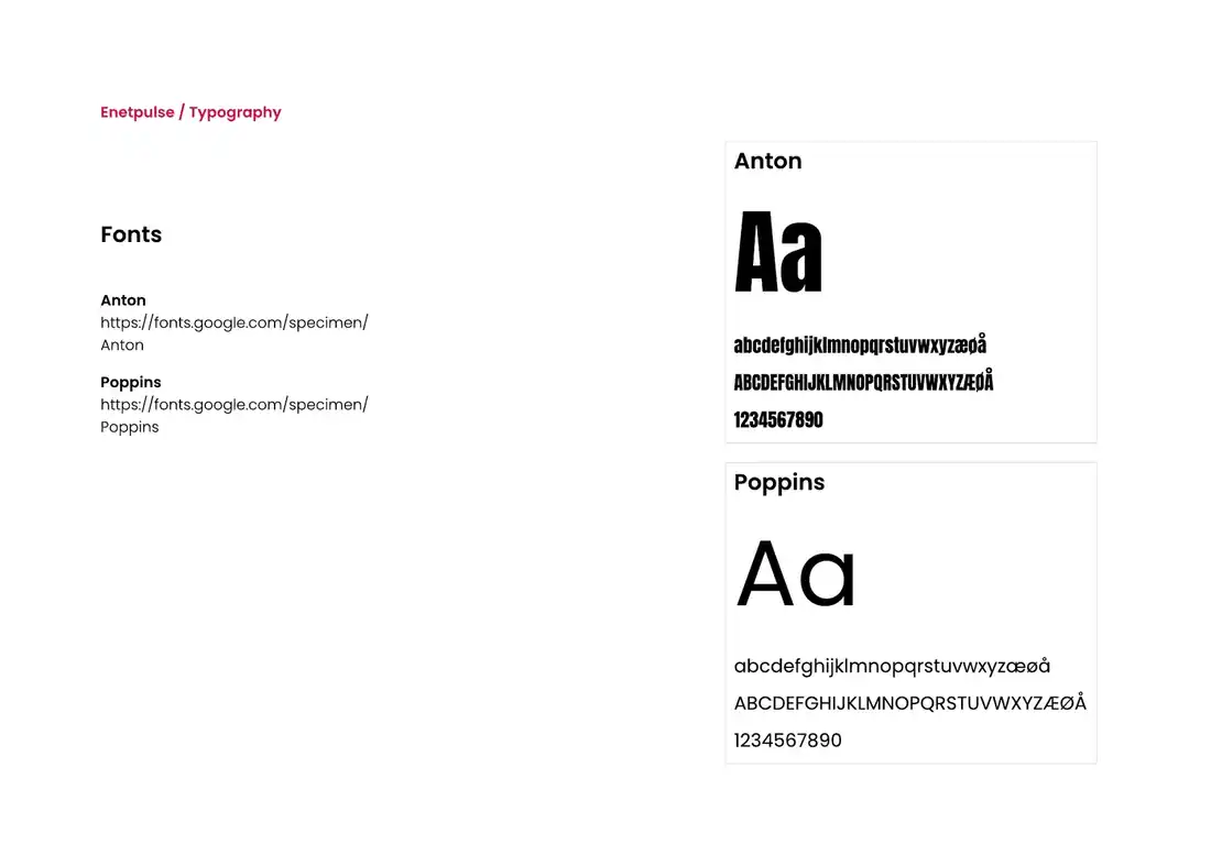
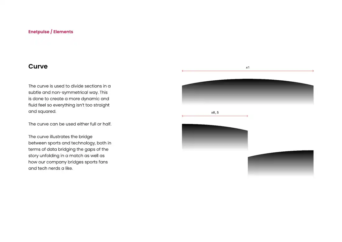
A visual identity built from scratch. One shared system for logo, colours and typography across Enetpulse.
 PrimaryColour
 PrimaryWhite
 SecondaryColour
 SecondaryWhite
Three
colours.
One pulse.
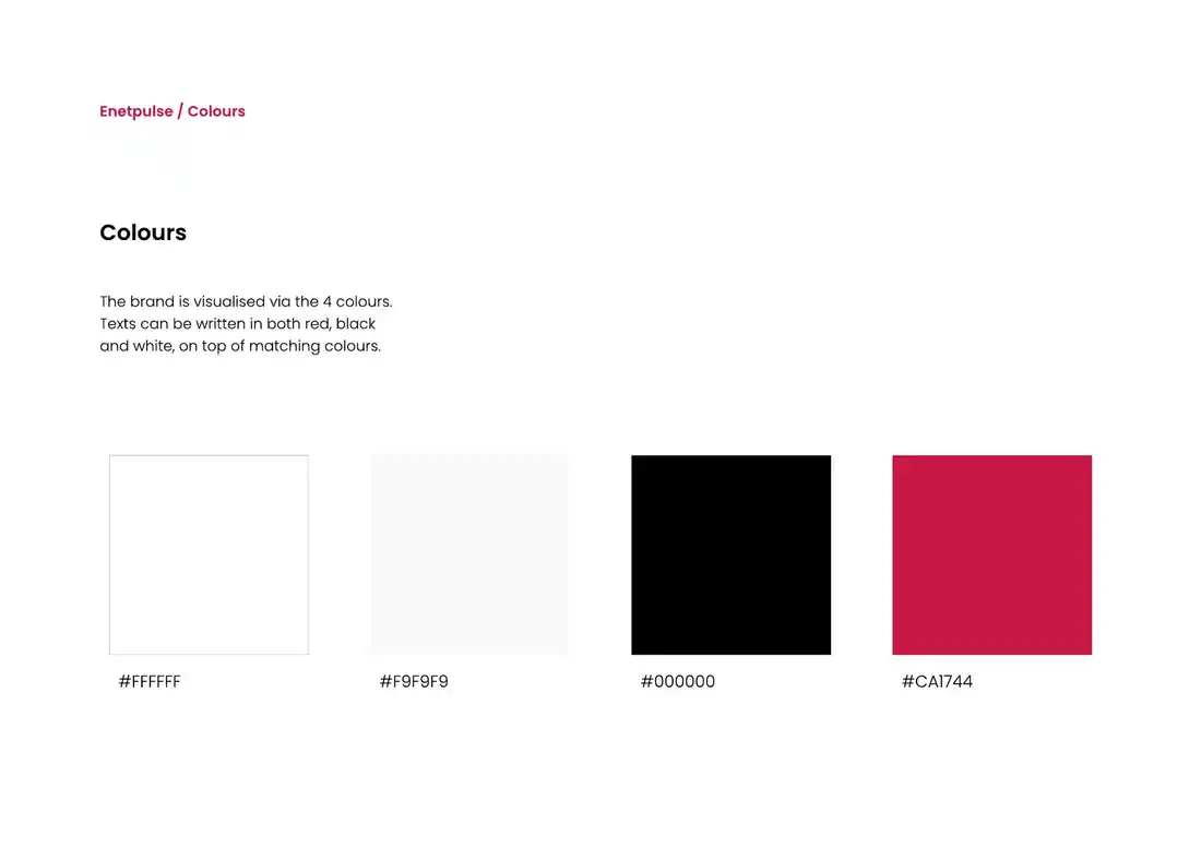
The palette is deliberately restrained. Black and white do most of the work. Red is the recognisable accent, used subtly so it stands out.
The
guide.
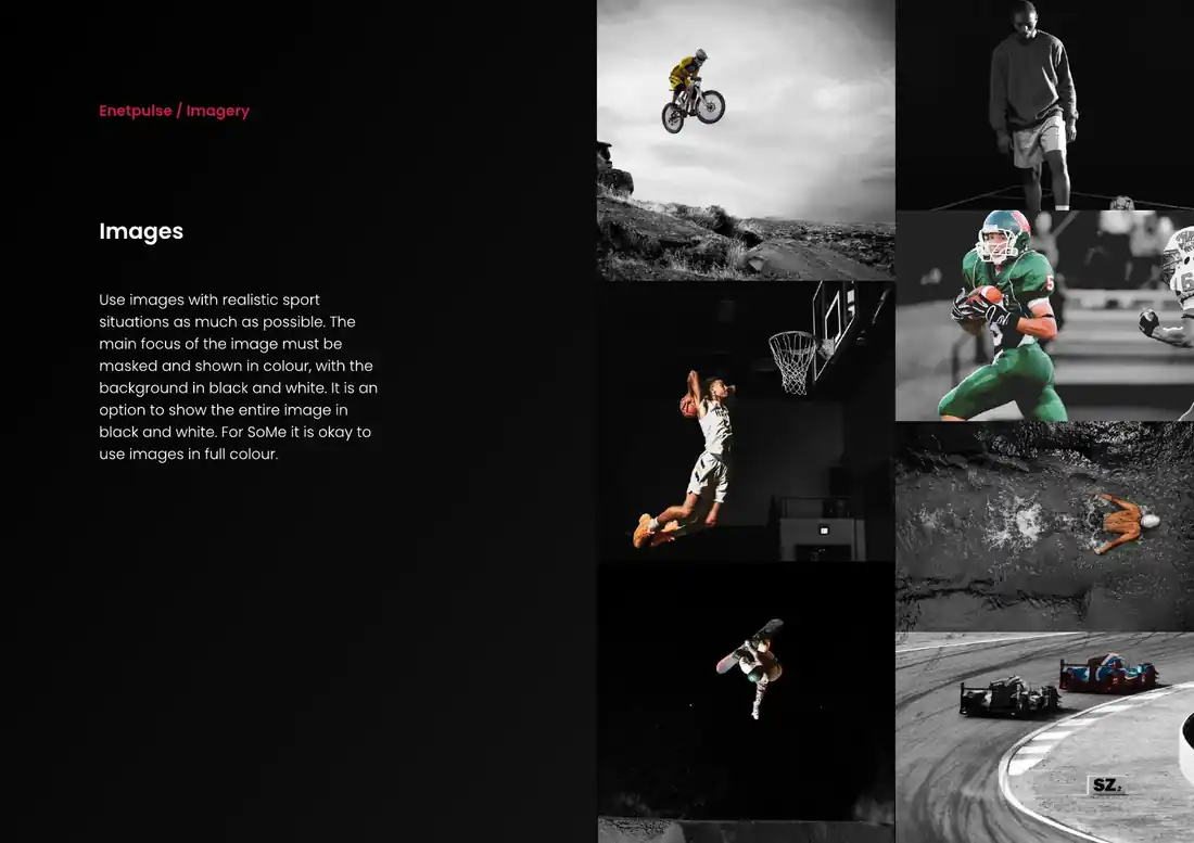
Not just a set of loose rules. The identity was collected into a complete brand guide, built as a shared reference for how Enetpulse should look and feel across touchpoints.
Built from
scratch.
A shared visual foundation that could move consistently from brand guidelines into digital products, sales material and everyday communication.
A LOT OF
THINGS.
ONE WEBSITE.
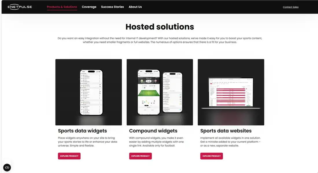
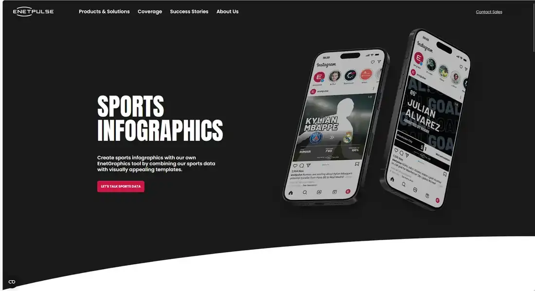
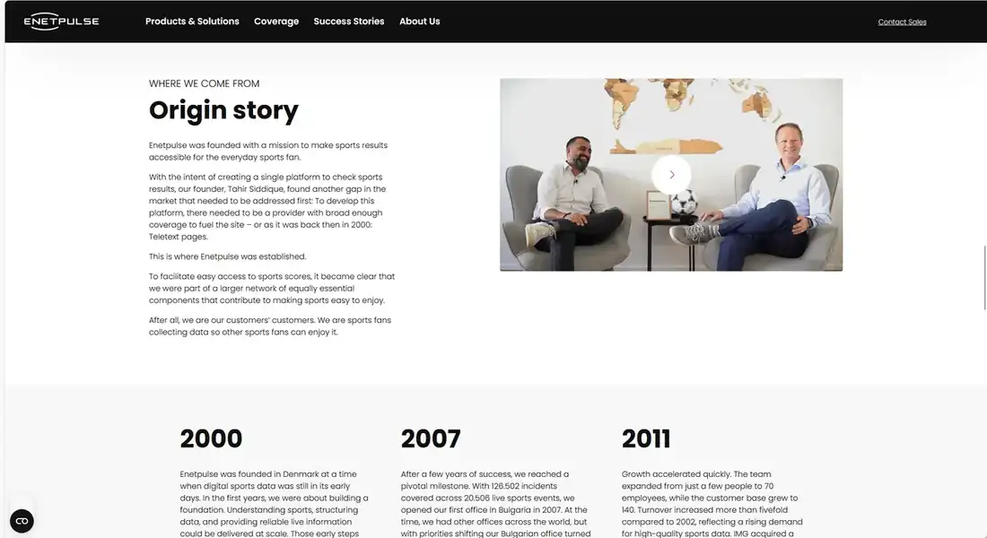
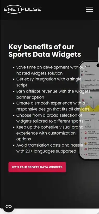
Enetpulse has products, sports, coverage, company stories and quite a bit in between. My job was to make all of it feel like it belonged in the same place.
Visit enetpulse.com ↗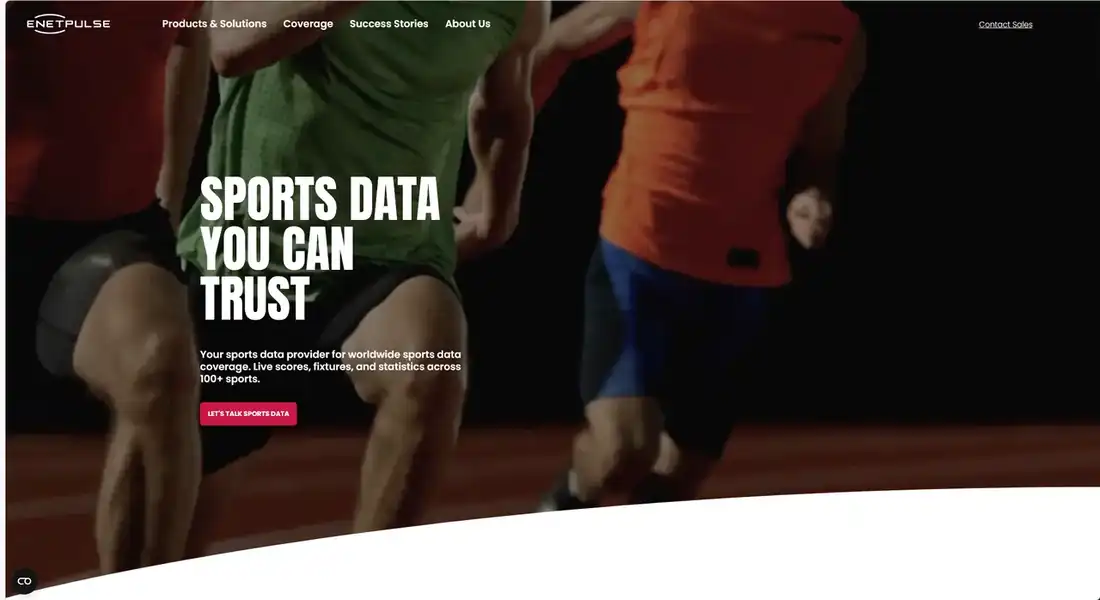
ONE SITE.
VERY DIFFERENT
JOBS.
A product overview, a visual sales page and a company story do not need the same layout. They do need to feel like they came from the same place.
LESS SPACE.
SAME WEBSITE.
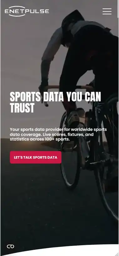
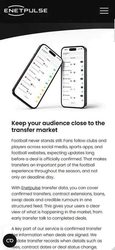
Everything had to stack, resize and move around without turning into a completely different design on smaller screens.
A lot of data.
Made simple.
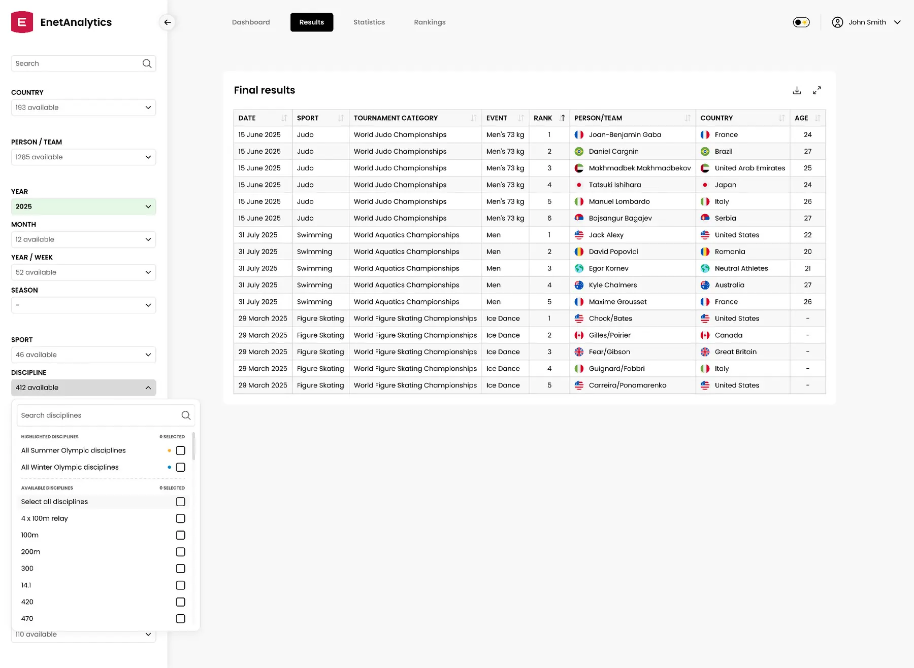
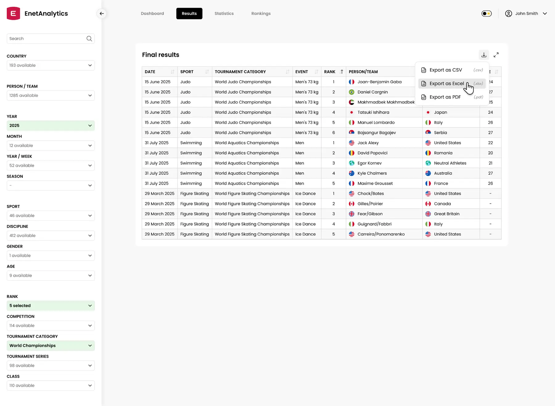
Built for people working with Olympic sports data. Athletes, teams, results and years of historical data, all in one place.
I was responsible for the UX and UI. The challenge was making all of it feel manageable.
Simple
was the
hard part.
The data specialists knew how everything should be categorised. My job was turning that structure into an interface people could actually work with.
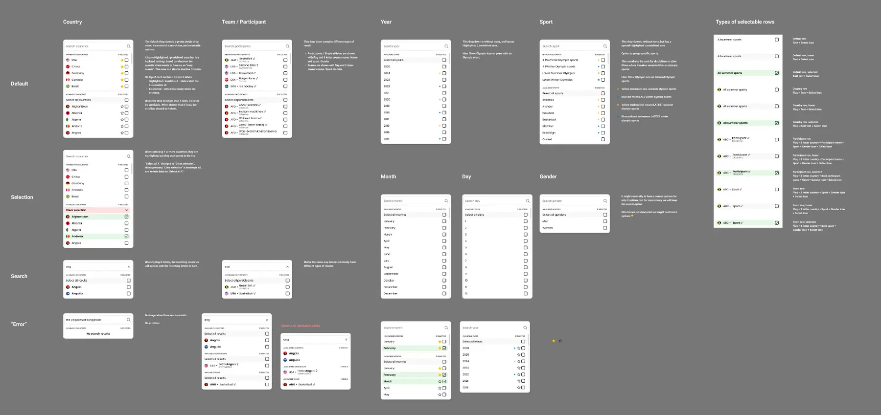
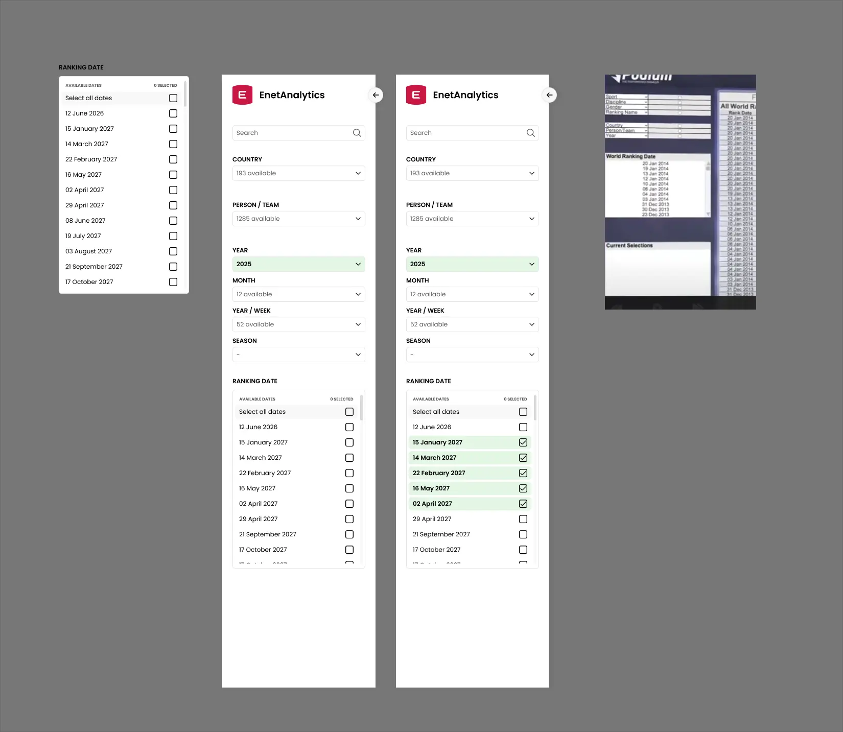
Hundreds of options still had to be there. Search, grouped filters and clear selection states helped keep it manageable.
Find it.
Filter it.
Use it.
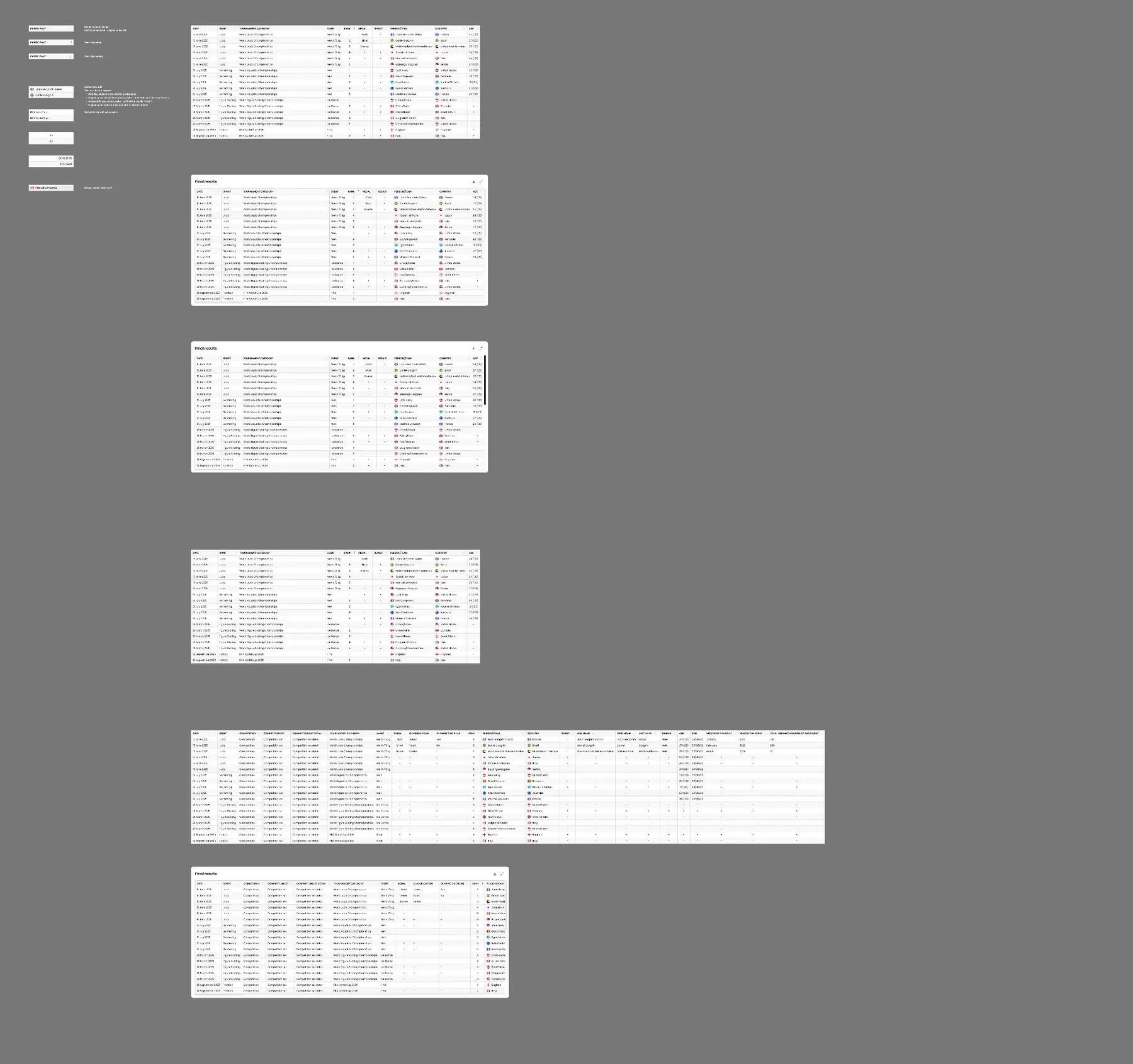
A working tool for digging through a lot of sports data without having to fight the interface first.
Once the right result was there, it could be taken further as CSV, Excel or PDF.

A better way
to predict.
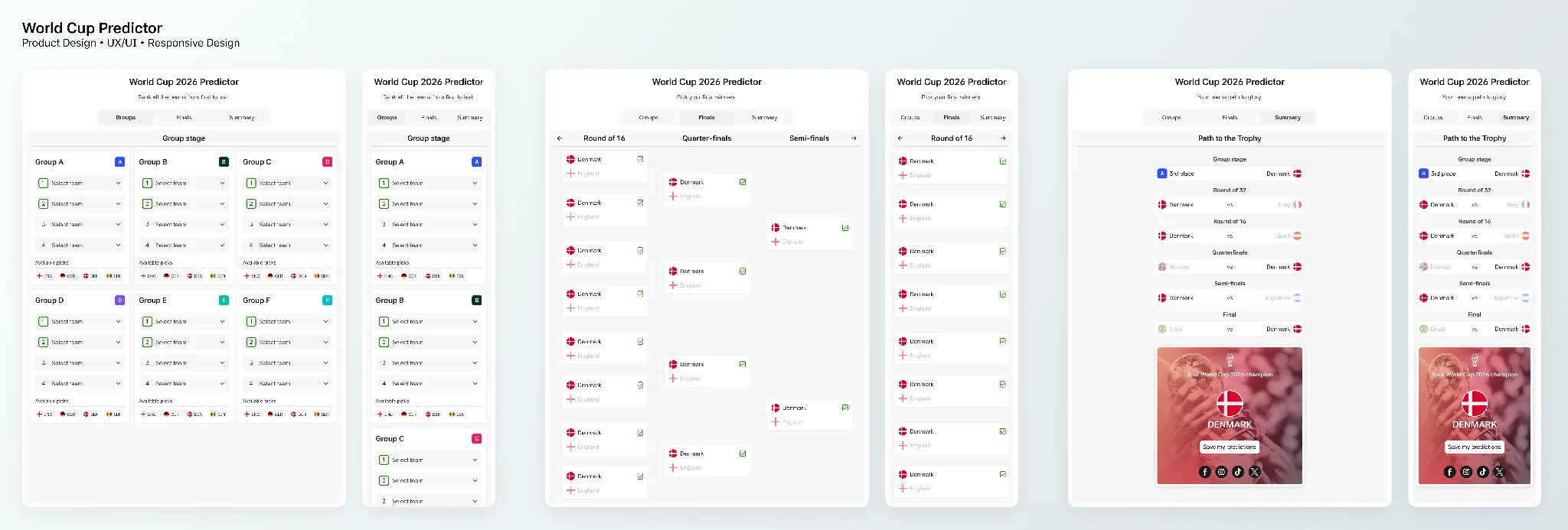
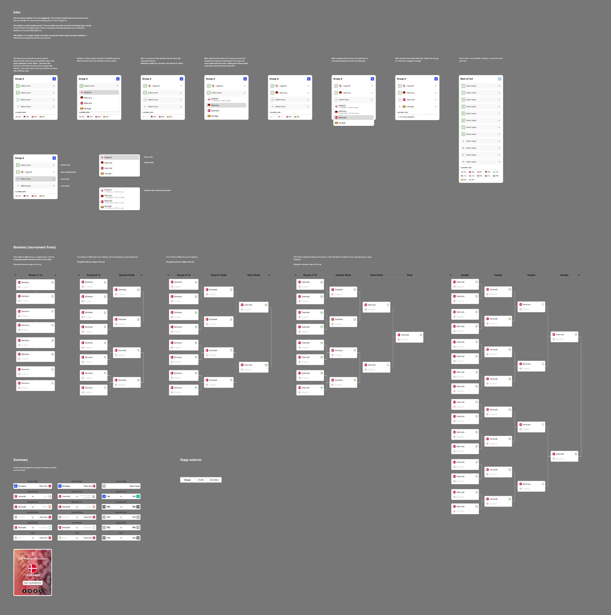
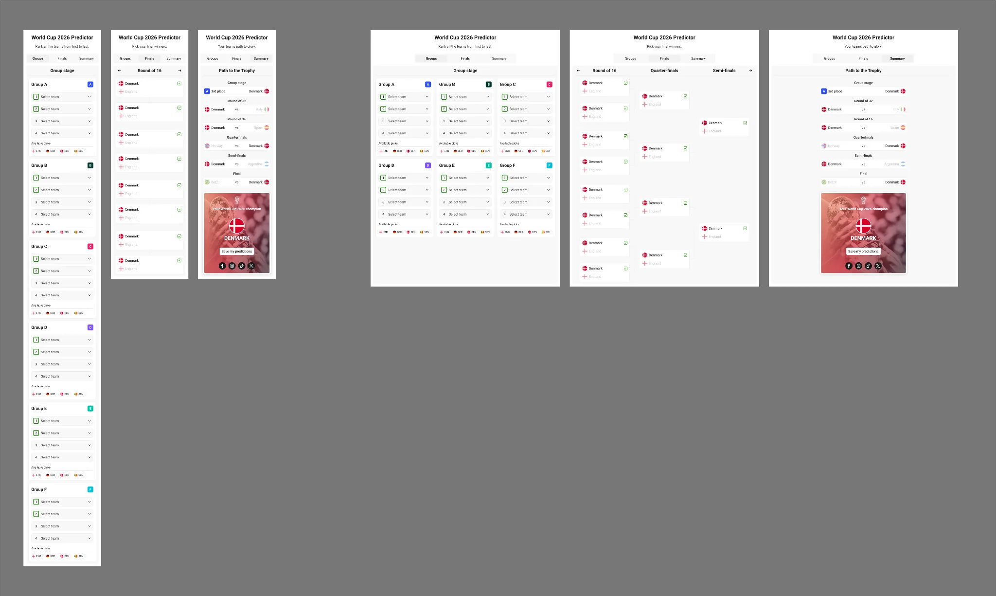
Our existing tournament predictor needed an update. I made a quick concept for a simpler, more flexible version, designed with the 2026 tournament in mind.
Group A
APick. Follow.
Share.
The idea was to keep the whole tournament in one simple flow. Pick the teams, follow them through the knockout stages and end with a prediction ready to share.
Built as a white-label concept, so customers could apply their own branding and use it directly on their own sites.
What if the
widget could
adapt itself?
I used Figma AI to explore a small tool for customising an existing sports widget. The idea was simple: change the important visual settings and see the result immediately.
 Premier League03/09/25 - 19:00

25 years.
One team.
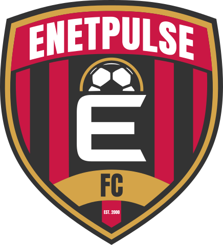
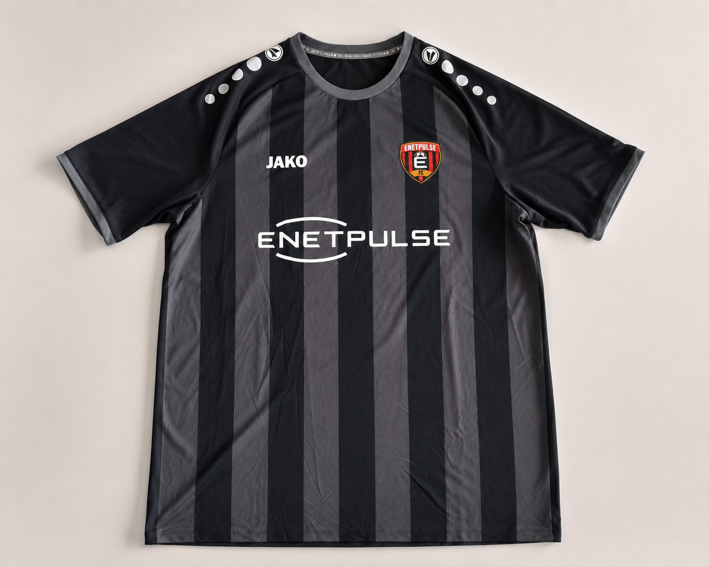
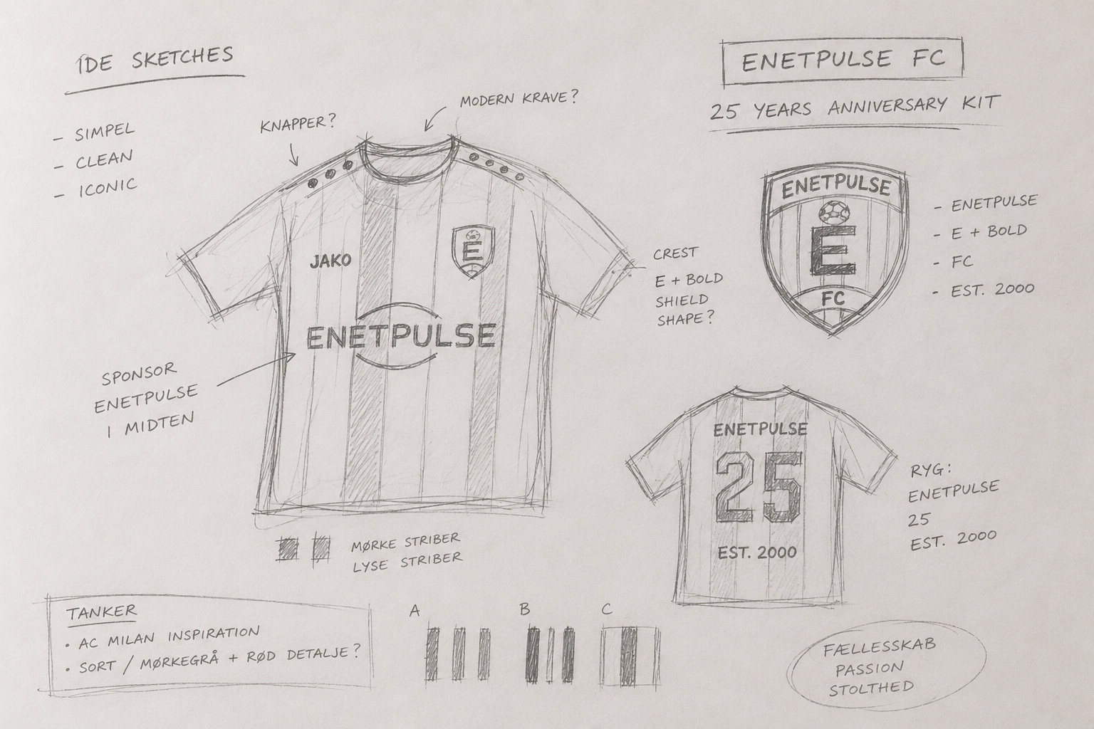
A 25th anniversary kit made for the people behind Enetpulse. I developed the concept, designed the crest and turned it into a shirt everyone in the company received.
From sketch.
To shirt.
The crest brings Enetpulse, football and the company’s founding year into one badge. The shirt kept things deliberately simple, with dark stripes and a small personal nod to my love of AC Milan.
The result was not just merchandise. Every employee got their own shirt, giving the anniversary something physical that belonged to the whole team.

From pixels.
To print.
And back again.
Design has taken me through quite a few different worlds. From signs, print and physical spaces to brand identities, websites and digital products.
I spent nearly 16 years at Enetpulse, working closely with developers, product people and colleagues across different countries. I like taking something complicated, splitting it apart and figuring out how to make it simpler, clearer and better looking.
The tools and formats change. The part I enjoy stays pretty much the same: making things that work, look right and make sense to the people using them.
I'm probably at my best as part of a team, with room for ideas, sparring and the occasional stupid joke.
Nearly 16 years at Enetpulse